How to Export Figma Design in Fluid Responsive Layout using Responsive Manager in UiChemy?
Use CSS Clamp in UiChemy's Responsive Manager to make font size scale fluidly between viewport widths.
When you export your design using Smart Auto Responsive, it's about 90% responsive on most devices by default. If you want to manually customize the responsive values, there are two ways to do it with Responsive Manager:
- Regular responsive layout
- Fluid responsive layout using CSS Clamp for font size
How CSS Clamp Works
To use CSS Clamp, set a minimum and maximum viewport width, along with a minimum and maximum font size. The font size then automatically adjusts for any viewport width in between.
For example, set an h1 font size of 32px at a minimum viewport width of 500px, and 50px at a maximum viewport width of 1600px, for any viewport width in between, the font size adjusts automatically. You only need to set the font sizes for the minimum and maximum widths.

Export as Fluid Responsive Layout
- Open the UiChemy plugin in Figma and make sure you're logged in.
- Select the top-level frame of your layout, choose Step by Step Method, and click Start.
- At the Responsive step, select Manual Responsive Setup to open Responsive Manager.
- In the Font Size tab, select Clamp to make the font size fluid across screen sizes.
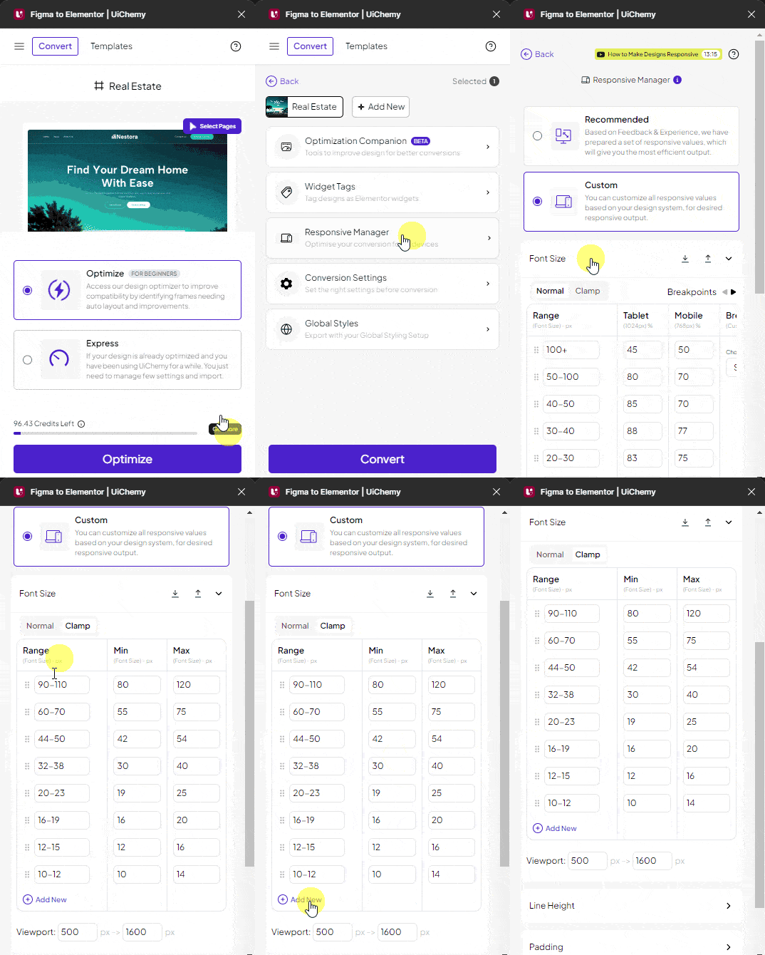
- Range, set the font size range in pixels (e.g.
20-30), calculated against the font size set in Figma. - Min, the font size for the minimum viewport width, in pixels.
- Max, the font size for the maximum viewport width, in pixels.
Click + Add New to add more rows, and the cross button in the Range column to delete one. In the Viewport section, set the minimum and maximum viewport size in pixels, the font size adjusts automatically based on these values.
If you leave the Viewport values blank, they default to a minimum of 500px and a maximum of 1600px.
You can adjust line height and padding the same way as in a regular responsive layout. Once your settings are done, close the Responsive Manager popup using the cross button. When you export the design, the exported template automatically adjusts font size according to viewport size.
Frequently Asked Questions
What should I do if my Figma design doesn't export correctly?
Make sure you're using Smart Auto Responsive, which typically achieves about 90% responsiveness. If issues persist, double-check that you've selected the correct frame and settings in Responsive Manager.
What are the best practices for setting font sizes with CSS Clamp?
Set a clear minimum and maximum viewport width along with corresponding font sizes, e.g. 32px at a 500px viewport and 50px at 1600px, so your text scales fluidly and stays readable across devices.
What happens if I leave the viewport values blank?
UiChemy defaults to a minimum viewport width of 500px and a maximum of 1600px. Customize these values if that range doesn't fit your specific layout.
Are there any limitations when using UiChemy for responsive design?
UiChemy only converts designs from Figma, and it doesn't support page builders like Divi or WPBakery, make sure you're exporting to a compatible builder like Elementor, Gutenberg, or Bricks.